Paid Ad Design
Challenge:
One of the primary challenges with this paid advertising campaign was balancing marketing’s need for prominent, message-heavy copy with the tight space and performance constraints of Google display ads.
Key messages like “Know Senior Housing,” “Understand the Risks,” and “Prove Your Expertise” were considered non-negotiable by stakeholders, even though they pushed against best practices for concise ad copy and visual hierarchy.
Additional challenges included:
Accommodating long taglines across multiple ad sizes without sacrificing readability
Maintaining brand clarity and credibility in small-format placements
Ensuring visual consistency across a full Google Ads size matrix
Preserving strong CTAs while avoiding clutter or cognitive overload
Creative Solution & Outcome:
To solve this, I approached the campaign as a modular system rather than individual ads.
I broke the messaging into a clear visual hierarchy, using stacked, color-coded message bars to allow multiple value statements to coexist without competing. This let us retain all required copy while guiding the viewer’s eye naturally from credibility → expertise → action.
I then designed a flexible layout framework that could scale seamlessly across all Google ad formats. Each component—headline blocks, CTA button, imagery, and brand elements—was built to rearrange intelligently depending on size, ensuring consistency and legibility at every breakpoint.
Key decisions included:
Using strong color segmentation to separate dense copy into digestible moments
Anchoring the layout with a single, confident CTA to drive action
Locking brand trust elements (logo, credibility cues) into predictable positions for recognition
Creating a repeatable system that allowed the team to deploy a complete Google Ads set efficiently
The result was a cohesive, on-brand paid campaign that met stakeholder requirements without sacrificing design integrity or performance, enabled rapid production of a full Google display ad suite from a single creative system, and drove a 10% lift in conversion performance.
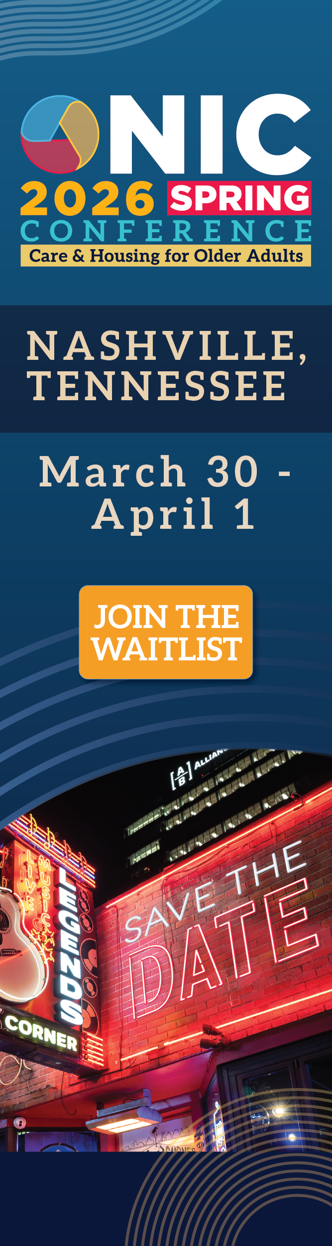
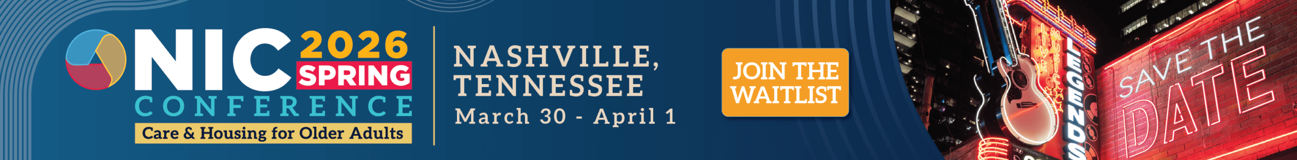
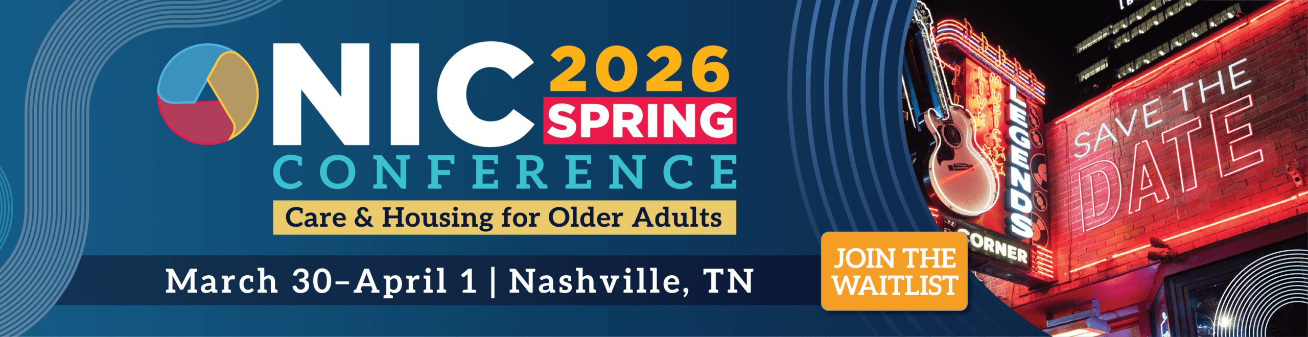
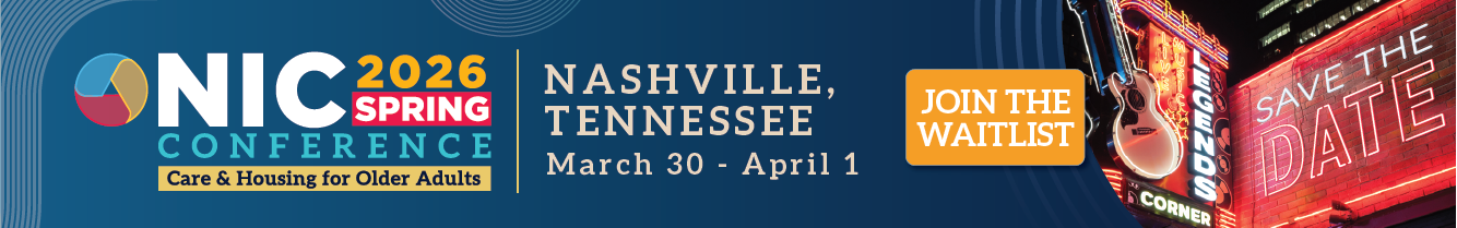
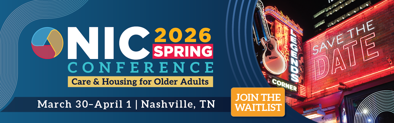
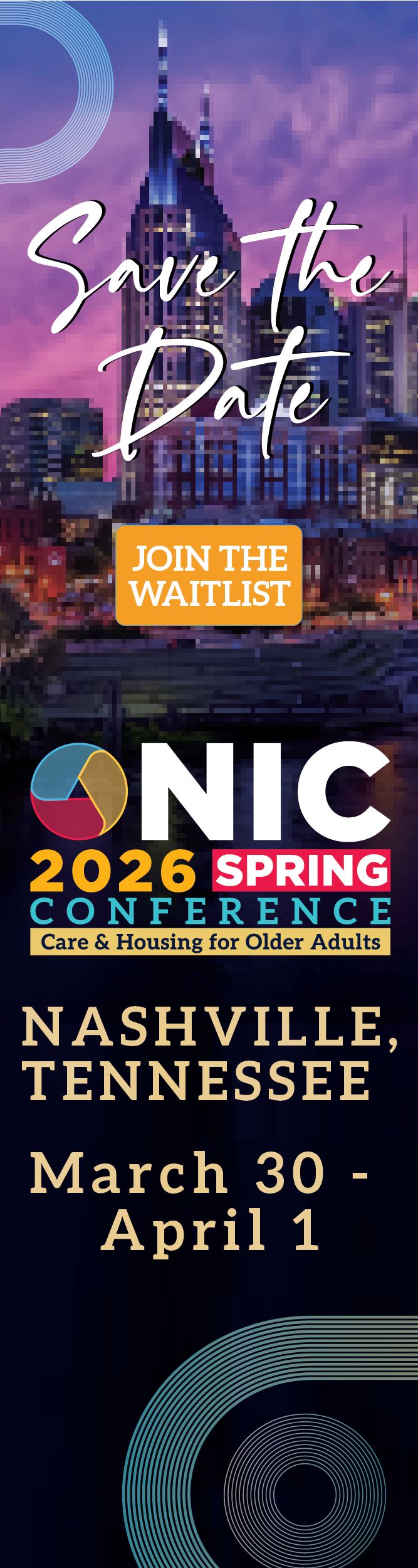
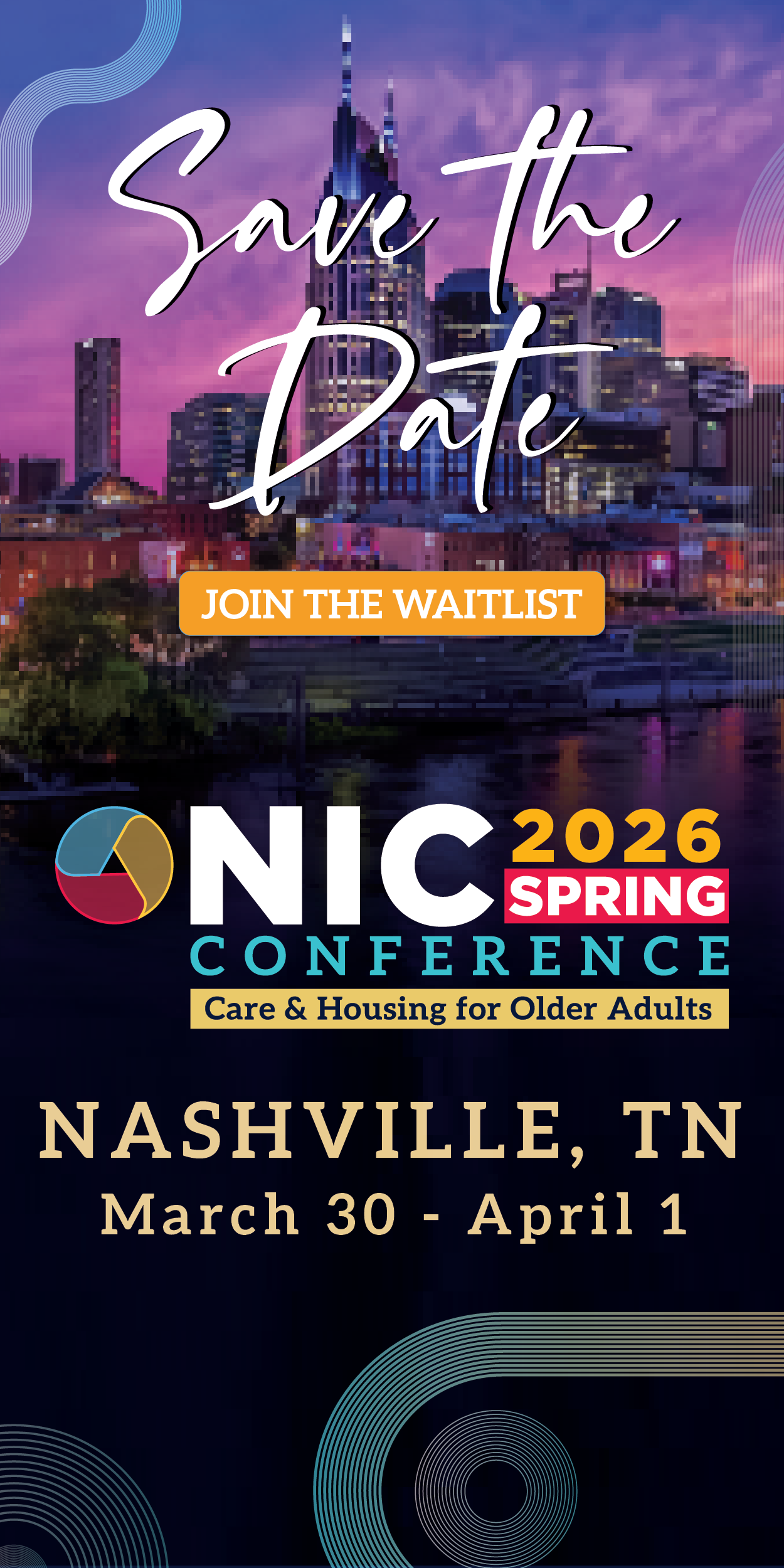
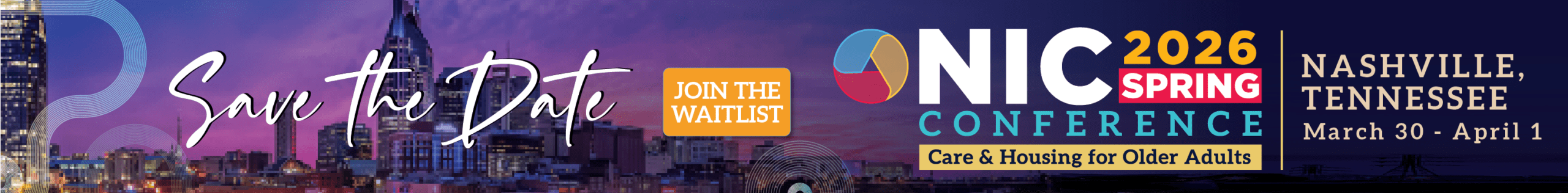
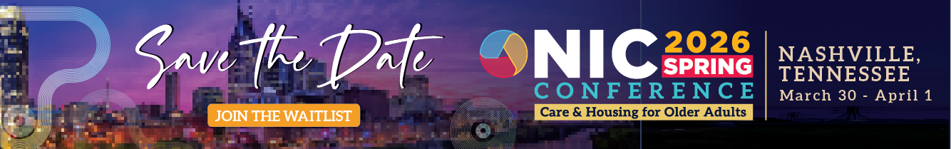
Challenge:
Challenge
The campaign required a full suite of Google display ads that balanced heavy conference messaging, a prominent “Save the Date,” and multiple CTAs—all while maintaining clarity and performance across formats and sizes.
Approach:
I designed a modular ad system and ran A/B tests across headline hierarchy, CTA language (“Join the Waitlist” vs. “Save the Date”), imagery treatment, and logo prominence. AI was leveraged to rapidly generate and iterate the Save the Date visual, significantly reducing production time and allowing more test variations without added cost.
A/B Testing Insight
The design variant featuring the large, high-contrast “Save the Date” visual with a simplified headline hierarchy consistently outperformed the more text-heavy option.
Why it won
Faster message recognition: Users immediately understood what the event was and when it was happening, even at smaller ad sizes.
Stronger visual hook: The bold Save the Date treatment acted as a single focal point, reducing cognitive load compared to versions with multiple competing text elements.
Clearer CTA path: Ads that paired the Save the Date image with a concise “Join the Waitlist” CTA drove more decisive clicks than versions that emphasized descriptive copy upfront.
Performance Outcome:
This winning variant delivered higher engagement and contributed to a 15% increase in conversion performance compared to previous year, validating that visual clarity and hierarchy outperformed copy density in display environments.