Visual Dashboard
Challenge:
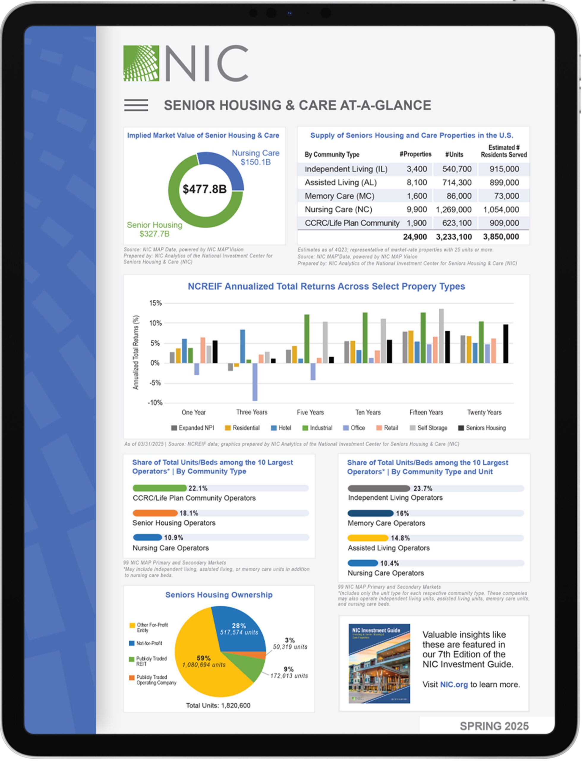
Tasked with transforming dense market data from NIC’s Research & Analytics team, I designed this one-page visual dashboard to provide a clear, digestible snapshot of the $477.8B U.S. seniors housing and care sector. The challenge was to distill complex datasets into an intuitive layout that could be understood quickly by investors, operators, and policy stakeholders.
Idea/Inspiration:
Translated financial, operational, and demographic data into a cohesive, user-friendly design.
Developed a modular grid system to visually organize seven unique data sets, including market valuation, property supply, NCREIF returns, operator share, and ownership distribution.
Applied color-coding, iconography, and clean typography to support information hierarchy and scanning efficiency.
Collaborated closely with NIC’s economists and analysts to ensure accuracy and visual integrity across multiple data touchpoints.
Designed for both digital and print use, ensuring clarity at various scales and platforms.