Project Overview
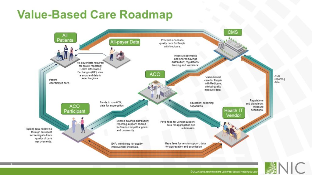
This presentation series was designed to simplify the highly complex ecosystem of Value-Based Care into a clear, easy-to-understand visual roadmap for senior housing operators, healthcare providers, and executive stakeholders. The challenge was translating layered relationships between CMS, MAOs, providers, residents, contracts, and care coordination into visuals that could be quickly understood by audiences with varying levels of industry knowledge.
Creative Approach
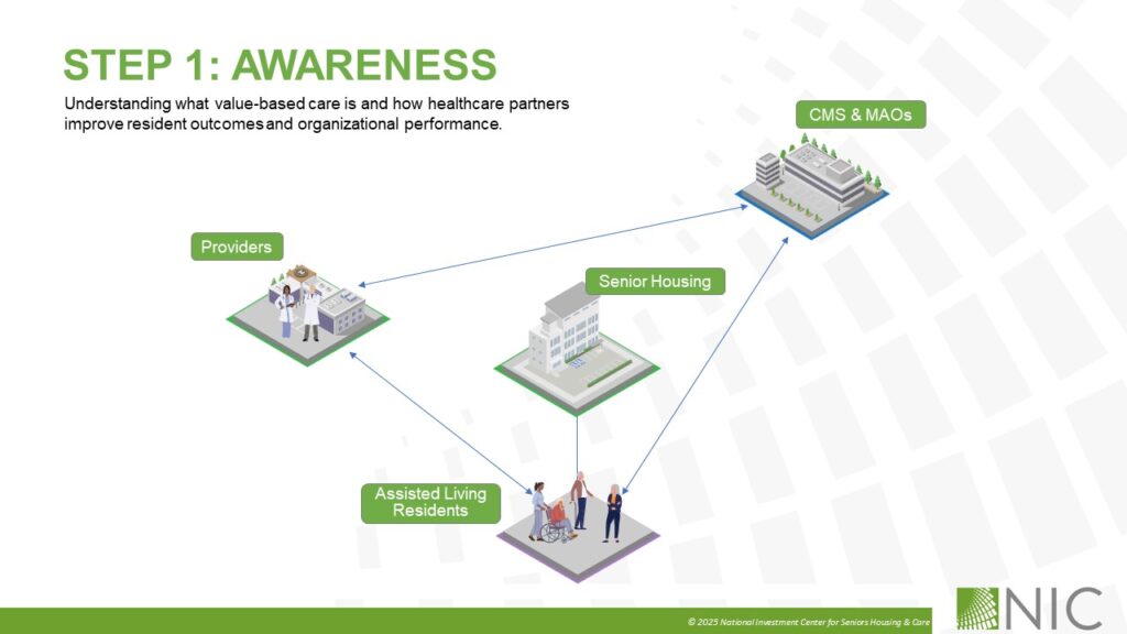
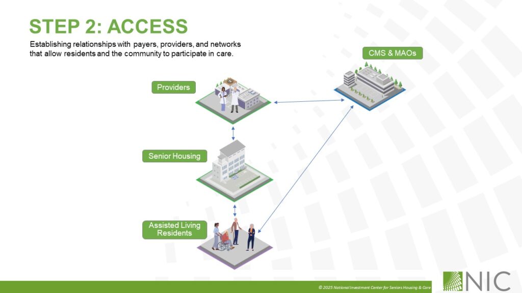
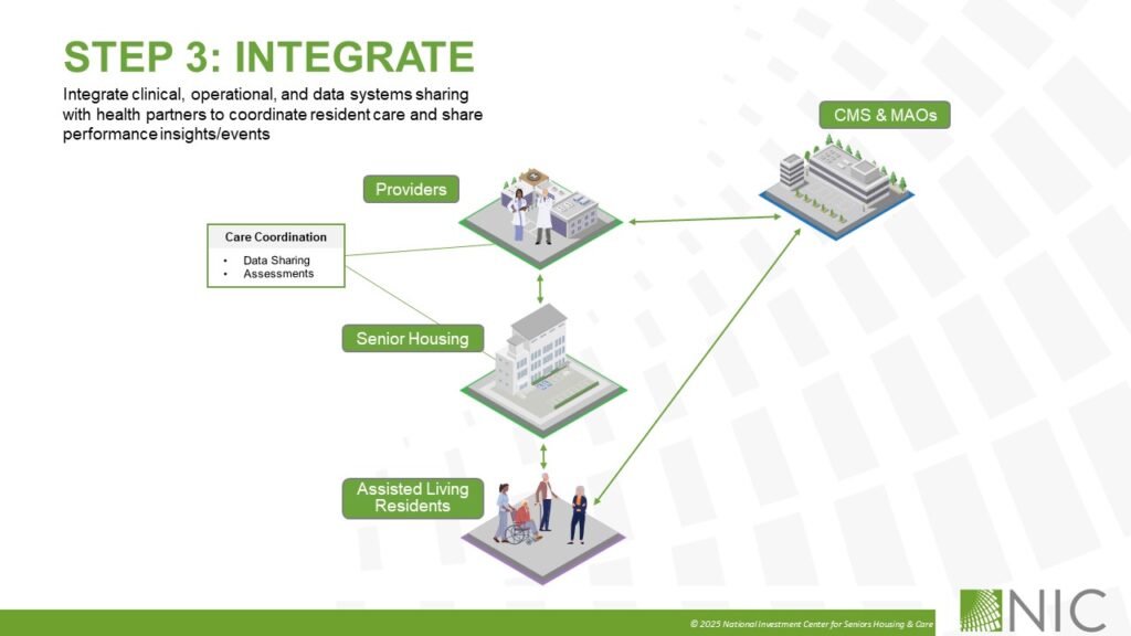
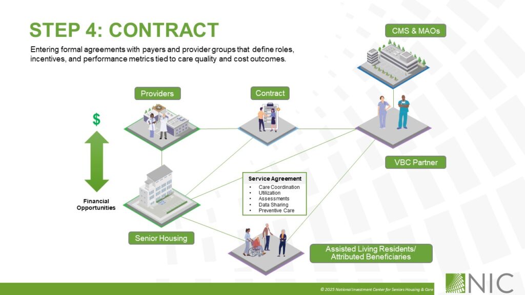
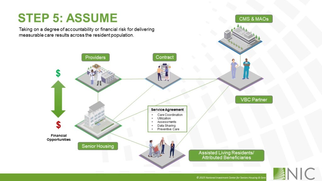
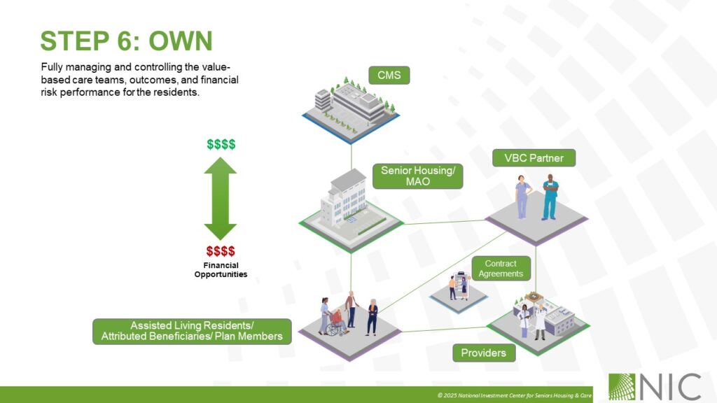
Using a structured six-step framework, the presentation progressively guided viewers from initial awareness through full ownership of value-based care models. Each slide was intentionally designed to reduce complexity through consistent visual systems, simplified information hierarchy, and intuitive diagram flows that visually reinforced the evolution of risk, accountability, and operational integration.
Design & Functionality
To improve usability and long-term scalability, every graphic, icon, label, connector, and layout element was built as fully editable PowerPoint vector artwork rather than flattened imagery. This allowed internal teams and presenters to easily customize messaging, update workflows, adjust branding, and tailor content for different audiences without requiring additional design support.
Outcome
The final presentation transformed a dense healthcare and financial topic into a polished executive communication tool that balanced strategic clarity, visual consistency, and operational flexibility. The result was a scalable presentation system that made complex value-based care concepts more accessible, engaging, and actionable for both industry experts and non-technical audiences.